Docs
Carousel
Use the carousel shortcode to display a carousel of several images.
Overview
Use the carousel shortcode to display a carousel of several images, with similar behavior as the image. As an example, the following shortcode displays a centered carousel with three slides, 16x9 aspect ratio, and a relative width of 67% on large screens.

{{< carousel ratio="16x9" class="col-sm-12 col-lg-8 mx-auto" >}}
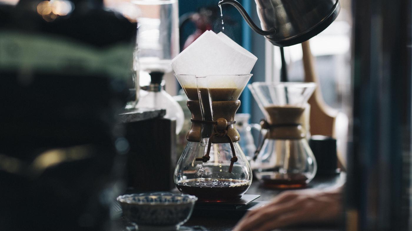
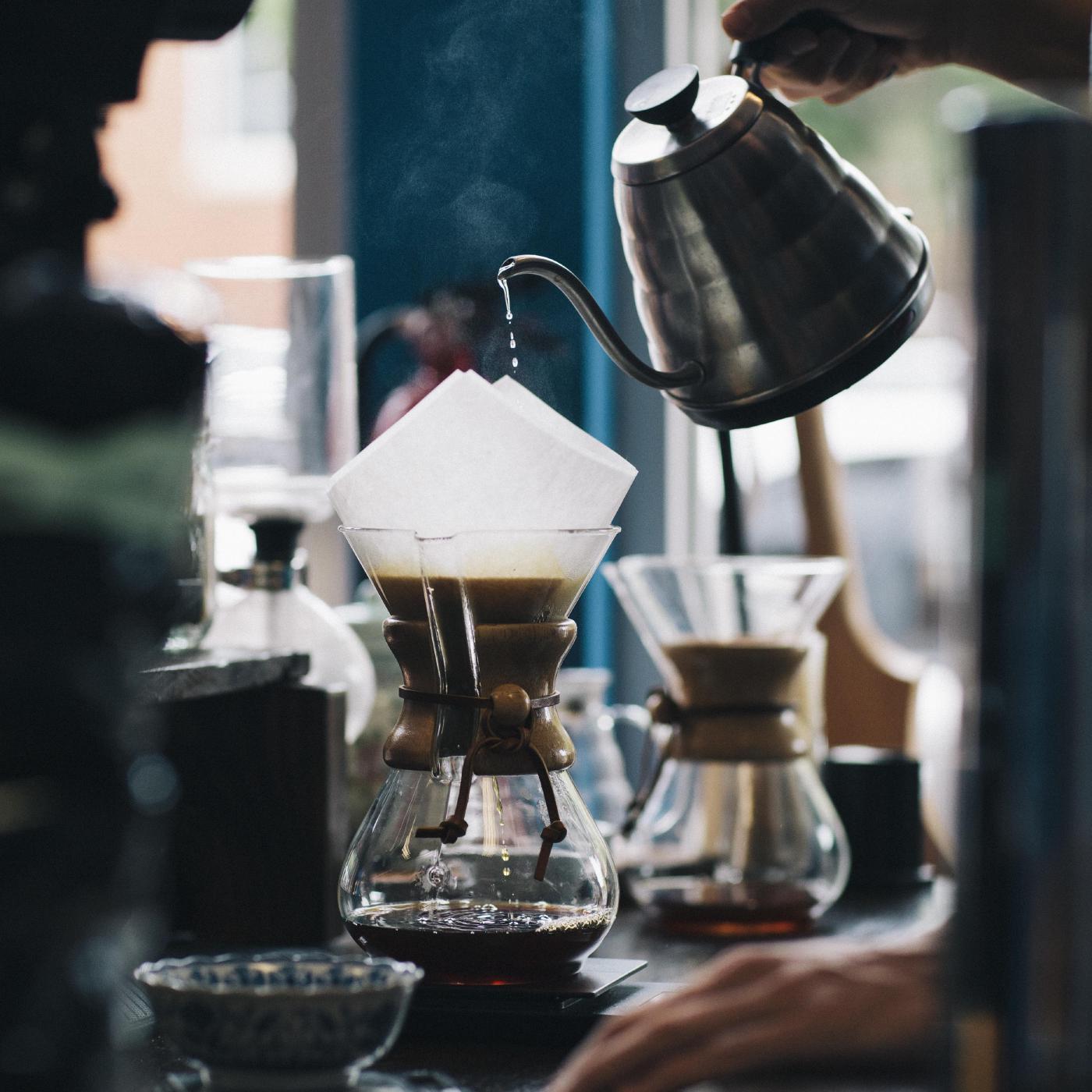
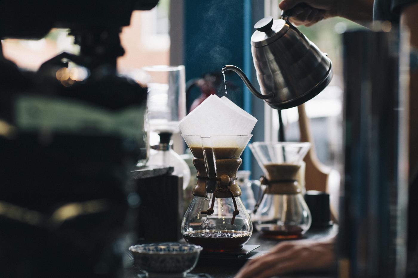
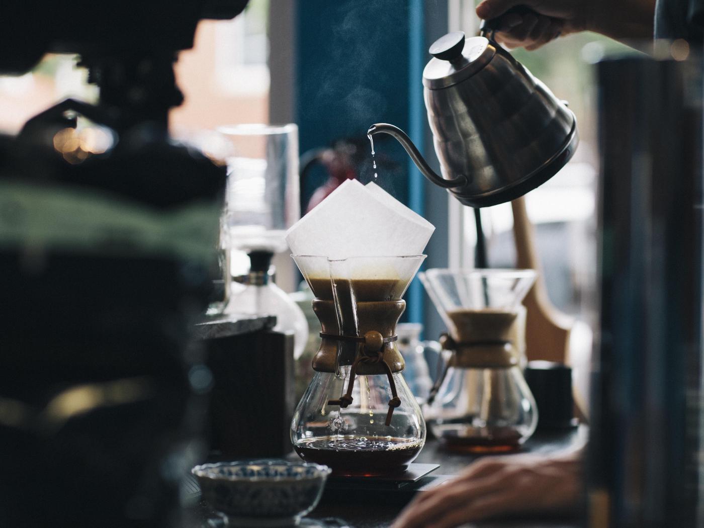
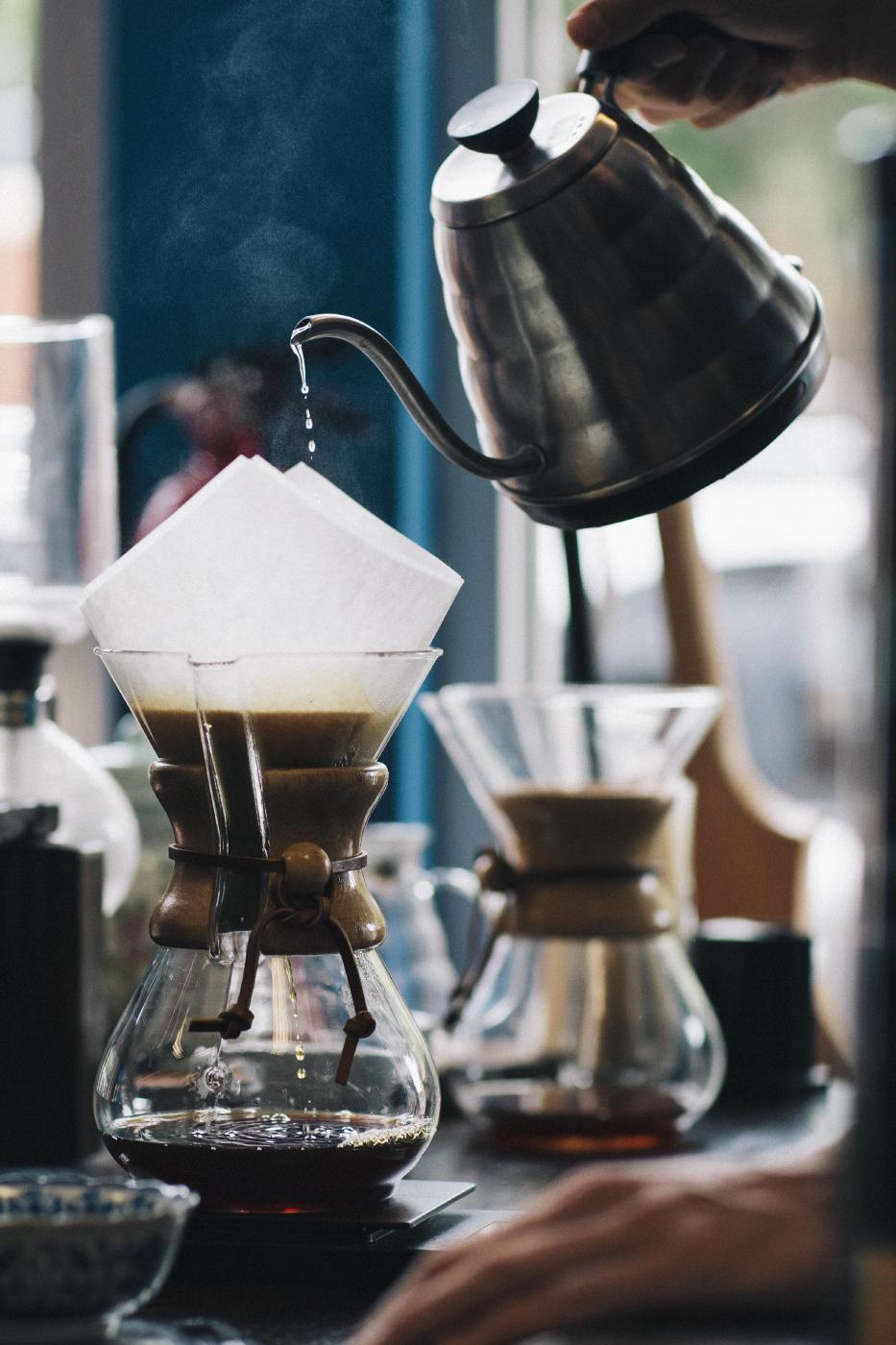
{{< img src="img/coffee.jpg" caption="slide 1" >}}
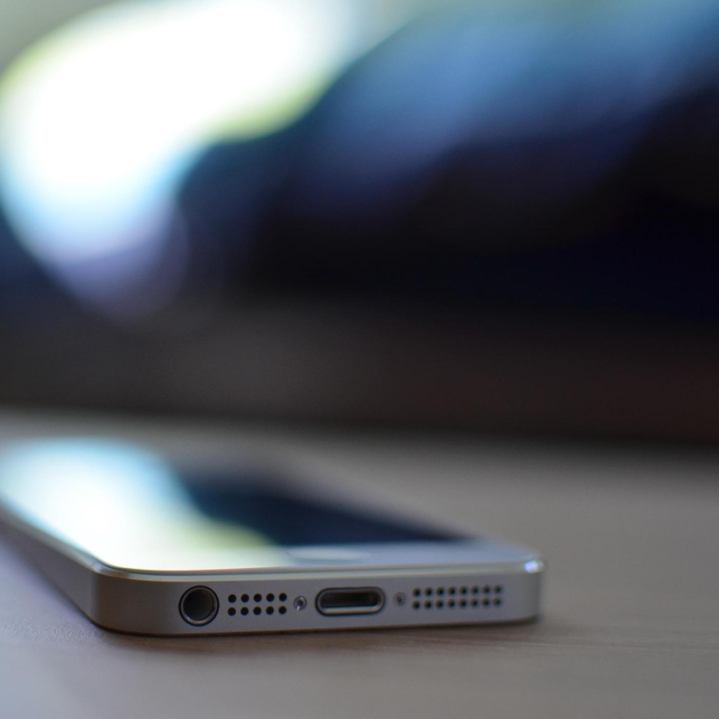
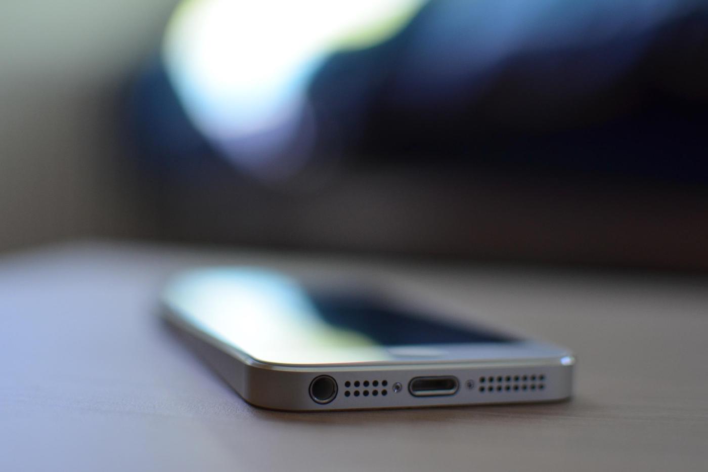
{{< img src="img/phone.jpg" caption="slide 2" >}}
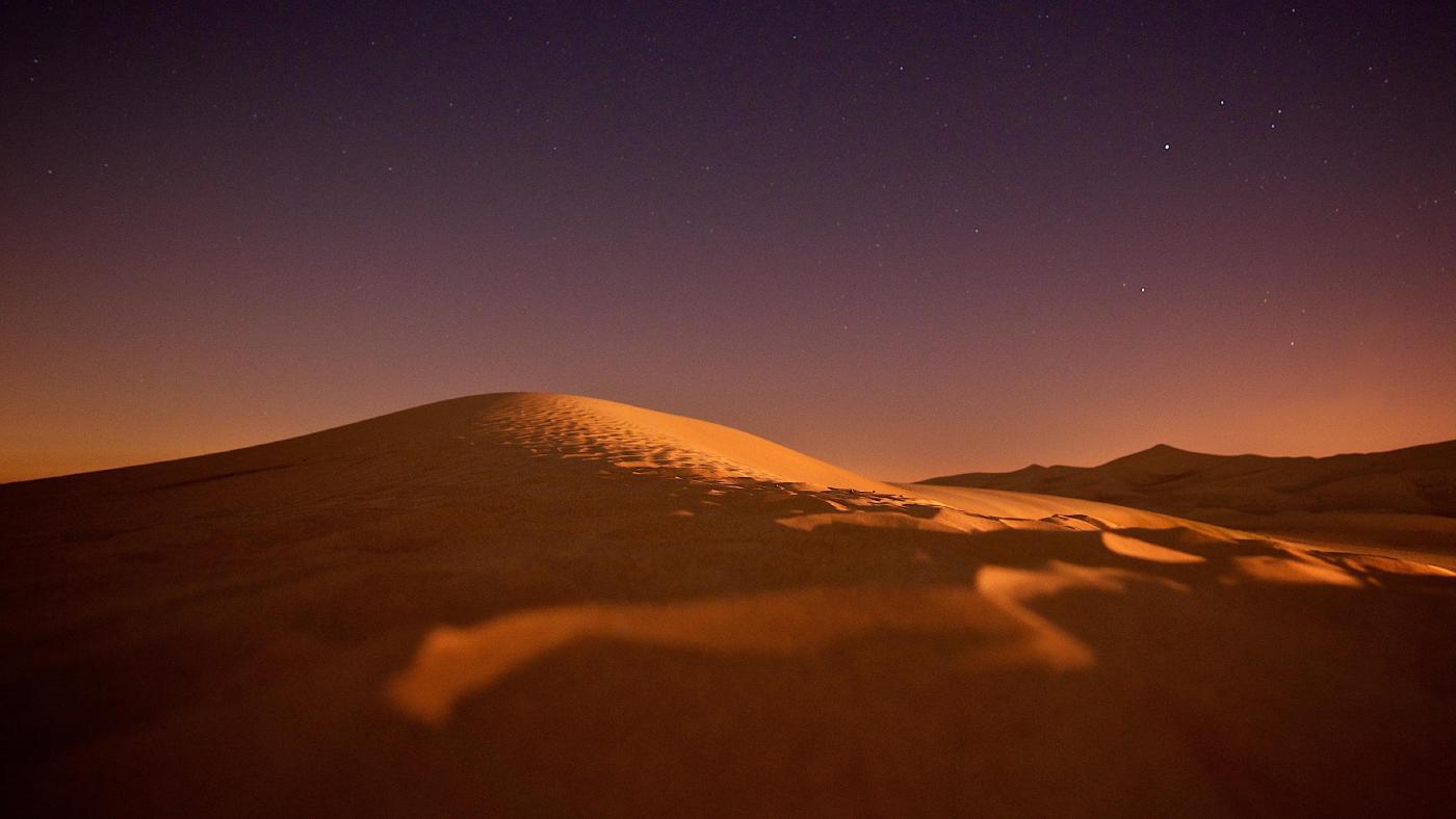
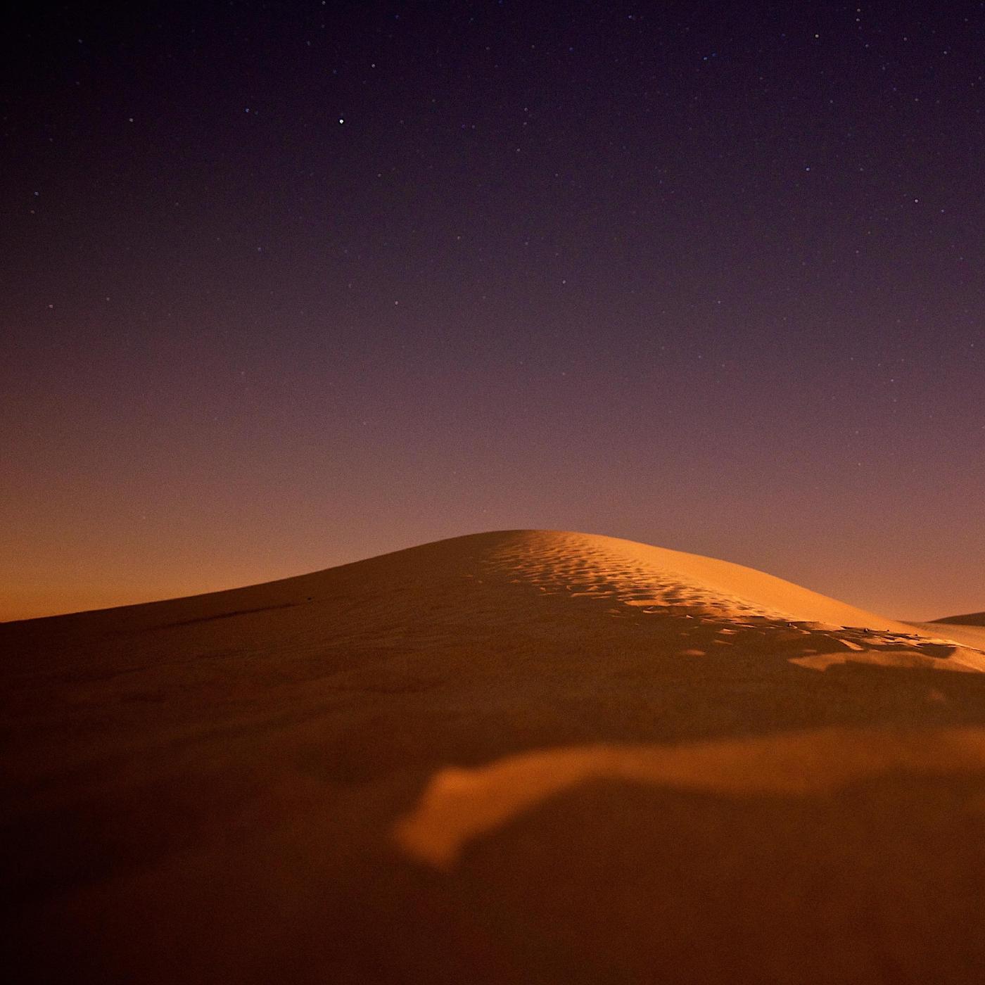
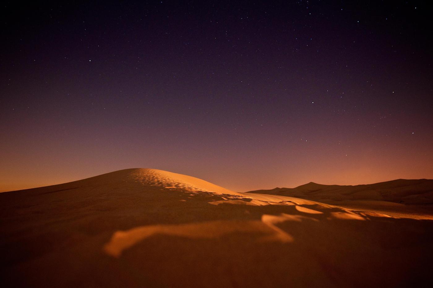
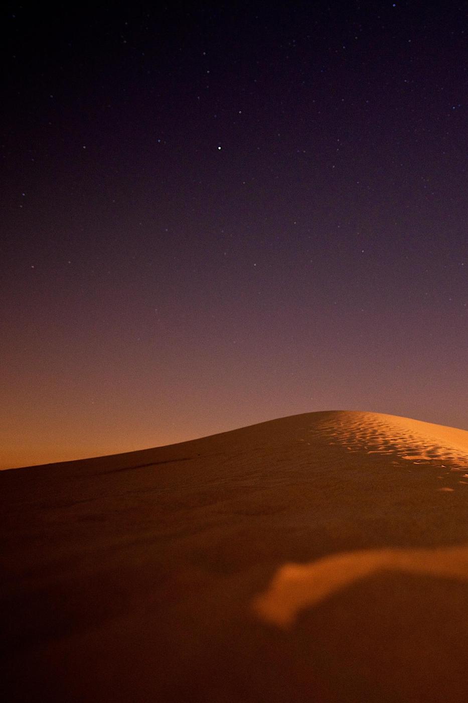
{{< img src="img/dunes.jpg" caption="slide 3" >}}
{{< /carousel >}}Arguments
The carousel shortcode supports the following arguments:
| Name | Type | Required | Default | Comment |
|---|---|---|---|---|
| class | string | Class attribute of the carousel element, e.g. w-75. |
||
| id | string | ID of the carousel, defaults to carousel-n with a sequential number n. |
||
| portrait | bool | false |
v0.18.3
|
|
| ratio | select | Ratio of the images. If set, the images are resized and cropped to match the ratio. Else the original aspect ratio of the image is kept. Supported values: [1x1, 3x2, 4x3, 16x9, 21x9]. |
Add an inner img element for each slide of the carousel. The img element supports the following arguments:
| Name | Type | Required | Default | Comment |
|---|---|---|---|---|
| active | bool | Sets the current carousel item as active (only one item at a time). By default, the first slide is made active. | ||
| caption | string | Carousel slide caption. | ||
| loading | select | eager | Loading behavior of the image. The loading of lazily loaded images is deferred until the image is within scrolling range of the viewport. This should reduce the initial loading time of the website. It is recommended to lazily load only those images that are below the pagefold. Supported values: [eager, lazy]. | |
| src | string | yes | Path or url of the image, e.g. img/example.jpg. |
Examples
As an example, the following shortcodes display a centered carousel with three slides and various aspect ratio.
Set the ratio to 1x1 for a square aspect ratio.
{{< carousel id="carousel-1x1" ratio="1x1" class="col-sm-12 col-lg-6 mx-auto" >}}
  {{< img src="img/coffee.jpg" caption="slide 1" >}}
  {{< img src="img/phone.jpg" caption="slide 2" >}}
  {{< img src="img/dunes.jpg" caption="slide 3" >}}
{{< /carousel >}}
Set the ratio to 3x2 for a landscape aspect ratio.
{{< carousel id="carousel-3x2" ratio="3x2" class="col-sm-12 col-lg-8 mx-auto" >}}
  {{< img src="img/coffee.jpg" caption="slide 1" >}}
  {{< img src="img/phone.jpg" caption="slide 2" >}}
  {{< img src="img/dunes.jpg" caption="slide 3" >}}
{{< /carousel >}}
Set the ratio to 4x3 for a landscape aspect ratio.
{{< carousel id="carousel-4x3" ratio="4x3" class="col-sm-12 col-lg-8 mx-auto" >}}
  {{< img src="img/coffee.jpg" caption="slide 1" >}}
  {{< img src="img/phone.jpg" caption="slide 2" >}}
  {{< img src="img/dunes.jpg" caption="slide 3" >}}
{{< /carousel >}}
Set the ratio to 16x9 for a landscape aspect ratio.
{{< carousel id="carousel-16x9" ratio="16x9" class="col-sm-12 col-lg-8 mx-auto" >}}
  {{< img src="img/coffee.jpg" caption="slide 1" >}}
  {{< img src="img/phone.jpg" caption="slide 2" >}}
  {{< img src="img/dunes.jpg" caption="slide 3" >}}
{{< /carousel >}}
Set the ratio to 21x9 for a landscape aspect ratio.


{{< carousel id="carousel-21x9" ratio="21x9" class="col-sm-12 col-lg-8 mx-auto" >}}
  {{< img src="img/coffee.jpg" caption="slide 1" >}}
  {{< img src="img/phone.jpg" caption="slide 2" >}}
  {{< img src="img/dunes.jpg" caption="slide 3" >}}
{{< /carousel >}}
Omit the ratio to keep the original aspect ratio.
{{< carousel id="carousel-original" class="col-sm-12 col-lg-8 mx-auto" >}}
  {{< img src="img/coffee.jpg" caption="slide 1" >}}
  {{< img src="img/coffee.jpg" caption="slide 2" >}}
  {{< img src="img/coffee.jpg" caption="slide 3" >}}
{{< /carousel >}}
Set portrait to true for a portrait aspect ratio.

{{< carousel id="carousel-portrait-3x2" ratio="3x2" portrait="true" class="col-sm-8 col-lg-6 mx-auto" >}}
  {{< img src="img/coffee.jpg" caption="slide 1" >}}
  {{< img src="img/phone.jpg" caption="slide 2" >}}
  {{< img src="img/dunes.jpg" caption="slide 3" >}}
{{< /carousel >}}